Agile and DevOps teams rely on data to make decisions. Yet if you’re a Jira user, you’ve probably felt some pain points with Jira’s built-in reports. The charts and gadgets Jira provides are okay for basic tracking, but are they enough to truly improve your team’s flow and predictability? Maybe not.
That’s where ActionableAgile® Analytics comes in – it’s designed to give you deeper, actionable insights right inside Jira.
In this post, we’ll compare Jira’s native reporting features with ActionableAgile Analytics side by side. We’ll see how each handles common needs like Cycle Time analysis, work-in-progress tracking, forecasting, and more.
The goal is to understand which tool actually helps you solve the problems slowing your team down, instead of just reporting them. Let’s dive in.
The Basics: Jira Reports vs. ActionableAgile® Analytics
Jira’s Built-In Reports:
Jira comes with a variety of out-of-the-box reports and dashboard gadgets (e.g. Control Chart, Cumulative Flow Diagram, Burndown Chart, etc.). These are convenient because they’re right there in Jira, showing live data with minimal setup.
If you need a quick view of sprint progress or how many issues were resolved vs. created, Jira’s default reports can do that. They’re also straightforward, you don’t need to be a data expert to use them.
However, teams often hit limitations with Jira’s built-in reporting. The insights can be superficial. You might get an average Cycle Time, but you won’t know the spread or if you have outliers causing delays. There’s little customization – you can’t add new types of charts or easily change what’s shown.
Cross-project reporting is limited too; most Jira gadgets focus on one project or board at a time.
The bottom line is Jira’s native reports give you basic awareness, but often leave you with more questions than answers about your process.
ActionableAgile® Analytics:
An Atlassian Marketplace app that lives inside Jira and was built specifically to analyze flow metrics and improve predictability. It’s like giving Jira a supercharged analytics brain. With ActionableAgile Analytics, you get a suite of advanced charts Cycle Time Scatterplots, Aging Work-in-Progress charts, Histograms, Throughput trends, and more.
These aren’t just for show; they let you see the reality of your workflow, including variation and outliers, which Jira’s reports often mask. ActionableAgile Analytics emphasizes statistical context.
For example, it can overlay percentile lines on your Cycle Time chart, so instead of just saying “average Cycle Time is 5 days,” you can see “85% of our items get done in 8 days or less.” That kind of insight helps you set realistic expectations (like SLA targets) and manage risks.
Another big plus: ActionableAgile Analytics has built-in forecasting (Monte Carlo simulations). You can literally forecast project completion dates or how many tasks you’ll get done by a certain date with a click – all based on your historical data.
Finally, ActionableAgile Analytics integrates smoothly, meaning you don’t have to export Jira data to use it. It pulls from Jira in real-time and updates the charts as your Jira issues update. The chart and the configuration you're looking at can also be saved and shared with colleagues to help everyone being on the same page (while respecting viewing permissions).
It basically turns Jira from a tracking tool into a learning tool for your organization. Instead of just seeing what happened, you start to understand why things happen and how to improve.
Feature-by-Feature Comparison
To make this concrete, let’s compare Jira vs. ActionableAgile Analytics on a few key reporting features that agile teams often care about:
1. Cycle Time Analysis (How long does work take?)
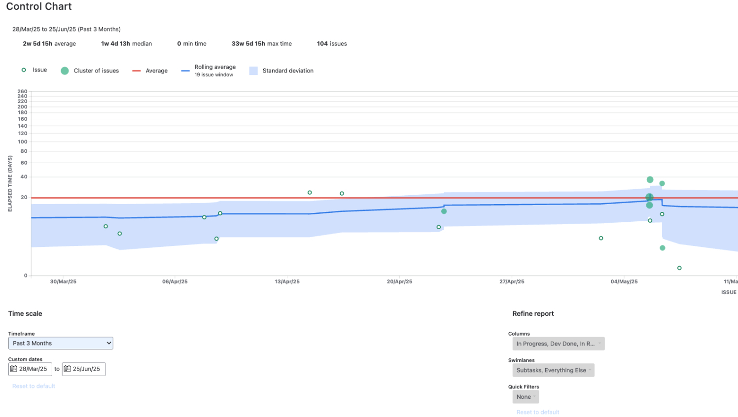
Jira’s Control Chart: Jira offers a Control Chart to visualize Cycle Time (the time it takes to complete an issue). It shows each completed issue as a dot and an average line. It’s useful for seeing overall trends. But it is quite limited for those seeking more.
The chart uses the average, which can be skewed by one or two really slow items. If one issue took 60 days but most take 5 days, that lone outlier will drag the average way up and paint an overly grim picture. Jira’s chart doesn’t easily let you filter those out or show percentile lines.
In short, Jira’s Control Chart gives you a hint at your Cycle Times but not the full story. You might still wonder, are we generally consistent or do we have a few huge outliers? Jira won’t answer that well.
ActionableAgile Analytics’s Cycle Time Scatterplot: The ActionableAgile Analytics scatterplot looks similar at first (dots over time), but it packs a lot more insight. It plots each item’s Cycle Time and can display percentile lines (50th, 85th, 95th percentiles, etc.).
So instead of just one average, you can see, for example, “half our tasks finish in under 4 days, 85% finish in under 8 days, but a few went way up to 20+ days.” This immediately tells you about variability and risk.
If you have a big gap between your 85th and 95th percentile lines, that means occasional items take much longer – maybe those are special cases worth investigating.
ActionableAgile Analytics also lets you filter by issue type or tag. Want to see Cycle Time just for user stories vs. bugs? Click a filter and you can. You can even toggle which phases of your workflow to measure (maybe you only care about coding+review time, excluding backlog wait).
All of that is point-and-click in ActionableAgile Analytics. The result is you truly understand your delivery times. Teams can then have conversations like, “Hey, 85% of our work gets done in under 8 days – that’s pretty good, but what’s up with these few that took 20+ days? Are they exceptions or a pattern we need to address?”.
Jira’s control chart alone rarely sparks that level of discussion because it doesn’t make the patterns obvious.
2. Managing Work in Progress (WIP) and Aging Work
Jira (no native aging chart): Jira doesn’t have a report to show how long each in-progress item has been open. You might use a dashboard filter to list issues “in progress > 10 days” or similar, but there’s no visual aging work-in-progress chart built into Jira Software.
This is a gap, especially for Kanban or flow-based teams. It means teams often miss early warnings that something is stagnating. Let’s say a ticket has been in the “Doing” column for 15 days, if your Cycle Time is usually 5 days, that’s a red flag. Jira itself won’t flash a warning; someone has to notice it manually.
ActionableAgile Analytics’s Aging WIP Chart: ActionableAgile provides an Aging Work in Progress chart that looks like a Kanban board view. Each column of the chart is one of your workflow states, and the tickets currently in that state appear as dots or bars. The catch?
The higher up the dot, the older that item is (how many days it’s been active).
This is super intuitive – at a glance, you see which work items are “aging” and might need attention. If a dot is creeping near the top of a column (say approaching your 85th percentile line for Cycle Time), it’s a visual signal that this item might blow past your usual timeline if you don’t do something. It basically answers the question “What’s about to become a problem?” every single day.
Teams using this chart often make it part of daily stand-ups: “Let’s check the aging WIP – oh, task XYZ has been in review for 9 days, which is unusually long for us. Should we escalate that?”.
Without ActionableAgile Analytics, you might not see that until day 20 when someone finally asks “Whatever happened to XYZ?”
In fast-moving environments and even more in regulated ones where delays can mean missed compliance dates, catching aging work quickly is crucial. ActionableAgile Analytics gives you that visibility; Jira doesn’t out-of-the-box.
3. Forecasting and answering “When will it be done?”
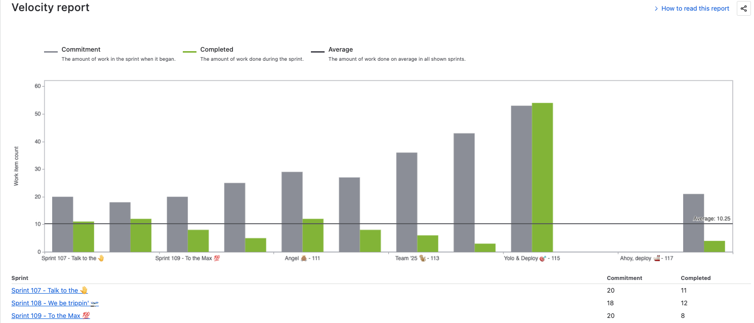
Jira’s approach: Jira Software doesn’t provide a built-in way to forecast how long a set of issues will take to complete. Velocity and Throughput averages make a big assumption: that your team’s pace and variability will stay the same in the future as it was in the past. But that’s rarely true.
Scrum teams often use Velocity charts or Sprint Burn-downs to guess at completion (e.g., “we do ~50 story points a sprint, so maybe 3 sprints to finish”).
This does not account for:
Changing team size
Scope creep or scope reduction
Story point inflation
Blockers or unplanned work
Kanban teams might try to use Control Charts or Throughput averages to project forward. These averages offer a single-point prediction with no understanding of variance or confidence. In the real world, variance matters more than the average.
Throughput-based averages (e.g., “we complete ~5 items/week”) ignore:
Fluctuations in ticket size/complexity
Seasonality (e.g., holidays, big releases)
External dependencies
Many teams are forced to export data to Excel or use add-ons from the marketplace if they want probabilistic forecasts.
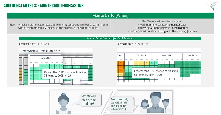
ActionableAgile Analytics’s Monte Carlo Forecasting: ActionableAgile has forecasting baked in. You can choose between two modes: “When will all these issues be done?” or “How many issues can we complete by date X?”. It then runs a Monte Carlo simulation (literally thousands of randomized trials based on your historical Throughput or Cycle Time data).
The output is a range of outcomes with probabilities. For example, ActionableAgile Analytics might tell you “50% chance to finish by May 15, 85% chance by May 22, 95% by June 1” for a given backlog. This is golden information for planning – it lets you communicate to stakeholders in terms of risk: “We’re pretty confident we’ll be done by the end of May, but there’s a small chance it could slip into early June.”
With Jira alone, teams often would either give a single date (which is usually wrong) or pad a lot “to be safe.” ActionableAgile Analytics’s forecast is data-driven and updates as your pace changes.
It’s also great for answering scope questions: “If we cut scope by 5 stories, what’s the impact?” or “If we pull in these 2 extra tasks, how might it affect the timeline?” You can simulate those scenarios quickly.
In a sense, ActionableAgile Analytics brings an analytics-driven negotiating tool to product and project management. You can say, “Sure, we can add that extra feature, but our 85% confident date then moves out a week – is that trade-off worth it?”
This level of clarity just isn’t available in Jira’s standard toolkit. And because ActionableAgile Analytics keeps this inside Jira, you don’t have to manually update spreadsheets for every change, It’s always using the latest data from your actual workflow.
Summing things up
When your data’s off, so is your direction. And eventually, your customers and stakeholders will be the ones to suffer. Here are the big reasons why teams choose ActionableAgile Analytics over sticking with Jira’s native dashboards:
Find Bottlenecks and Outliers Easily: ActionableAgile Analytics highlights where your process is hurting. Jira might tell you the average, but ActionableAgile Analytics will show you “these 5 tasks took 3x longer than the rest – and they all happened in the Design phase, maybe that’s a bottleneck.” It brings the exceptions to the forefront so you can do something about them. With Jira alone, you often only catch these in hindsight (or not at all).
Data-Driven Forecasting: If you need predictability (who doesn’t?), ActionableAgile Analytics’s Monte Carlo simulations are a game changer. You stop making wild guesses about timelines. Instead, you get probabilities that help set realistic expectations. Teams that use it often find that stakeholders trust them more because they’re transparent about uncertainty (“We’re 90% confident in this range”) rather than overconfident in a single date that slips. It’s a more professional way to forecast work, and it’s automated – so you can run a new forecast anytime as things change. This is especially important for project managers or product owners who have to report upwards; you can defend your projections with data.
Improve Team Conversations: This might sound soft, but one of the coolest things about having richer metrics is how it changes the team’s behavior. Instead of opinions like “I feel like we’re always stuck waiting on QA” you can look at a chart and say “Actually, our QA stage has 3 days of wait on average, which is 30% of our Cycle Time – that is significant, let’s fix it.” It focuses discussions on facts.

"A big takeaway is being able to support meaningful conversation with our business partners [Stakeholders], that align to the value stream(s). Having an elevated level of trust in the data of how we operate to support outcomes is a must have."

Comprehensive Solution in One Tool: With ActionableAgile Analytics, you don’t need five different add-ons or exports. It covers Cycle Times, Throughput, WIP limits, Work Item Age, flow efficiency, and forecasting all together. Some teams try to patch together multiple tools: Jira for basic charts, plus Excel for deeper analysis, plus maybe a custom script or two. That’s a lot of maintenance and the context-switching can be painful. ActionableAgile Analytics consolidates a lot of that. And because it’s designed to work with Jira data structure, it’s less fiddly than a generic BI tool. You don’t have to be a data scientist to use it – it was made for practitioners (product managers, Scrum Masters, team leads) who just want answers from Jira without hours of wrangling. In terms of cost-benefit, many consider it worth it because reclaiming the time spent on manual reporting and avoiding project delays pays for itself.
Thinking of leveling up your agile metrics in Jira? Consider giving ActionableAgile® Analytics a try. Many teams, from startups to large enterprises, have made that jump and never looked back.
You can start by exploring some resources on the 55 Degrees blog or checking out customer stories. When you’re ready, start a free trial and begin your journey to better data.