If you're using a Cloud version of ActionableAgile Analytics, you've probably seen frequent updates throughout the year. I'm happy to share that we have another significant update scheduled for later this month, which will mark the completion of our major 5.0 release. For Jira Data Center users looking forward to it, rest assured - version 5.0 will be ready for download around the end of June.
ActionableAgile Analytics 5.0 introduces a range of new features and improvements designed to enhance your user experience and make analyzing your data easier than ever. Keep reading to find out more.
What's New in ActionableAgile Analytics 5.0
Re-imagined Dashboard
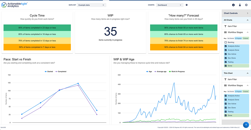
We've made the dashboard your starting point for all data sets. It offers a comprehensive view of key metrics, making it easier for you to track progress and make informed decisions quickly. Our eventual goal is to enhance the dashboard further by adding more details and allowing you to customize what appears there in the future.
Certain elements from the previous dashboard have been carried over to the new version, such as tracking work in progress (WIP), cycle time expectations, and simulation results for how many items can likely be completed within 30 days. We've taken it a step further by including information not only for the 85th percentile but also for additional percentiles like 50th, 70th, and 95th.
To address user confusion around the previous stability insights, we've introduced a Pace chart that analyzes work started versus completed each month along a combined WIP and Age chart. This chart presents three interconnected metrics on a single graph - showing, for any date, the number of items in progress, the total combined work item age (a valuable risk indicator), and the average age of individual work items. If you’re familiar with Little’s Law, you’ll see that monitoring these charts will help you establish and maintain your system’s stability!
New Help Center and Newsfeed
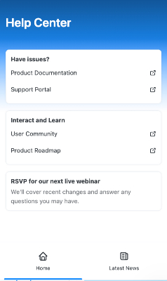
Communicating with users within the app itself is hands-down the best way to share vital information. Therefore, we’ve introduced a brand-new Help Center accessible from the question mark icon located in the bottom-right corner of the app. You can find easy links to our support portal, community site, roadmap, and more here. The Help Center features a newsfeed where we share updates on new features or other essential information. A red dot on the help center icon indicates unread newsfeed updates.
We're thrilled to start this journey of discovering how we can connect with you, our valued users. Whether you are a seasoned professional or new to ActionableAgile Analytics, these tools are designed to assist you in maximizing the value you seek from the application.
Easily Collapsible Sidebar
Let’s be real here - diving into the app settings never really made sense just to collapse or expand the sidebar. We're stepping up our game with a sidebar that you can conveniently hide and show whenever you want, allowing you to have more screen space for what truly matters—your data.
Intuitive Workflow Stages Control
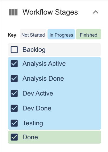
Long-time users of our app know that the first checked stage in the workflow stages control marks where work is considered started, and the last checked stage marks where work is first considered finished.
But that's not good enough for us! We want users to intuitively know how the app works. So, we've updated the control to add visual signals so you can see how the stages are classified based on your selections.
Painless Data Selection for Charts
Have you had a chance to check out our new and improved date control, where you can select a specific portion of your data to analyze? In addition to dragging to select a subset of your data, you can instead use the inputs located just above.
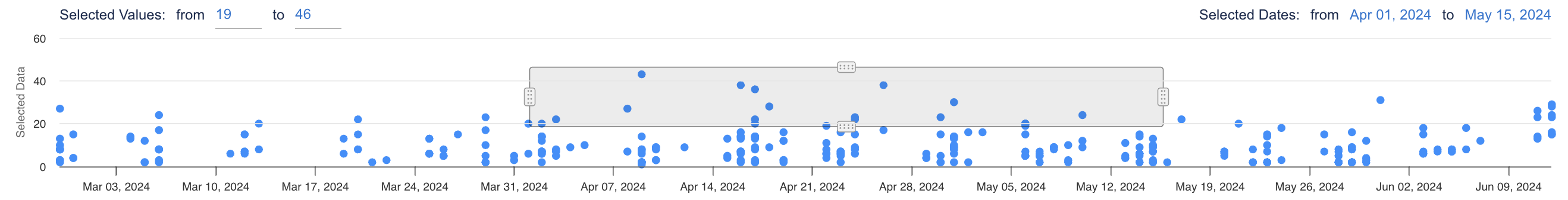
This reduces the pain users have previously experienced when trying to pick a specific date range. And don't forget, once created, you can still easily drag, drop, or even resize your selection.
Enhanced Chart and Simulation UI
The Flow Efficiency Chart and Monte Carlo Simulations (How Many and When) have undergone significant improvements! The updated design makes it easier for everyone to grasp the information at a glance. The purpose of these charts is now more evident, with essential details no longer tucked away in the sidebar.
This marks just the start of our mission to simplify new user onboarding. We are committed to further enhancing these and the rest of our charts as we move forward.
Zoom Capability
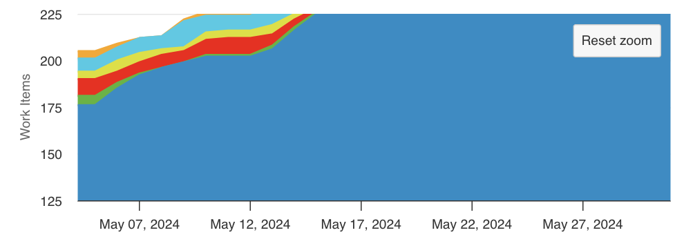
Would you like to examine a specific section of your chart more closely? You can now zoom in without affecting any of the calculations activated when modifying the selected data for the chart. These small enhancements can greatly improve your analysis of complex data sets!
Improved Source Data Readability
We've also focused on making it easier to view the source data that ActionableAgile Analytics uses to render the charts and run the simulations. Now, we have frozen header rows and columns, which allow sorting so you can easily find what you’re looking for.
And Much, Much More...
These are just a few highlights of what's new in ActionableAgile Analytics 5.0. It is impossible to list every single difference as we've literally overhauled every feature and touched every line of code to bring you a more powerful and user-friendly experience.
Why the Big Update?
You might be curious about the reasoning behind our decision to implement such significant changes. The answer is straightforward—transitioning from legacy code empowers us to:
Comprehensively grasp every facet of our codebase.
Leverage modern, supported libraries such as Highcharts, facilitating the swift addition of new features and charts.
However, these updates do come with a small task for our users. You'll need to reconfigure the settings in the chart controls for each data set you visit, but only once per data set. But, this change will allow us to have configurations that are compatible with features we'd like to add, such as deep-linking to a specific, full-configured chart for a data set.
Join Our Live Webinar
To help you get acquainted with all the new features and improvements, we're excited to announce that we're hosting a live webinar on June 25th at 15:30 (GMT+2). During this session, we'll walk you through the changes and answer any questions you might have. Please don't miss this opportunity to learn more about ActionableAgile Analytics 5.0 and get your questions answered. If you can't make it, please don’t worry. We’ll have the recording available following the event. RSVP now!
Stay tuned!
Are you excited to dive in? You'll be pleased to know that these updates are just around the corner, likely by the end of June—or maybe even sooner, depending on where you use ActionableAgile Analytics. We'll ensure all users see an announcement pop-up in the app once we've launched version 5.0. We're eager to hear what you think! Head on over to the 55 Degrees community and let us know!