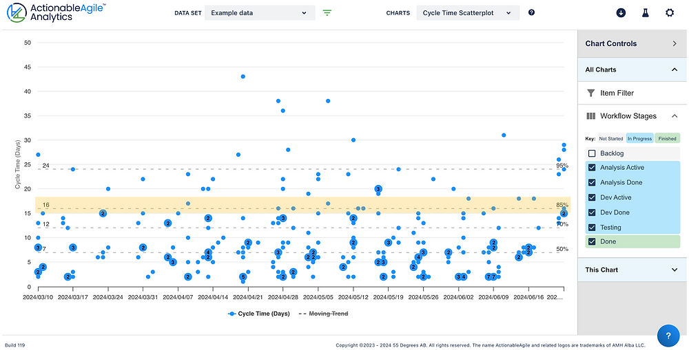
The Cycle Time Scatterplot chart is arguably the best way to view your Cycle Time data - the total elapsed time it took for individual items to move from one point of your workflow to another - usually from start to finish.
Why is it the best? Because Cycle Time is all about time and the Scatterplot lets us see Cycle Time data in the context of time. The position on the horizontal axis tells us when the item was finished and the position on the vertical axis tells us how long the item(s) took.
What can I learn from this chart?
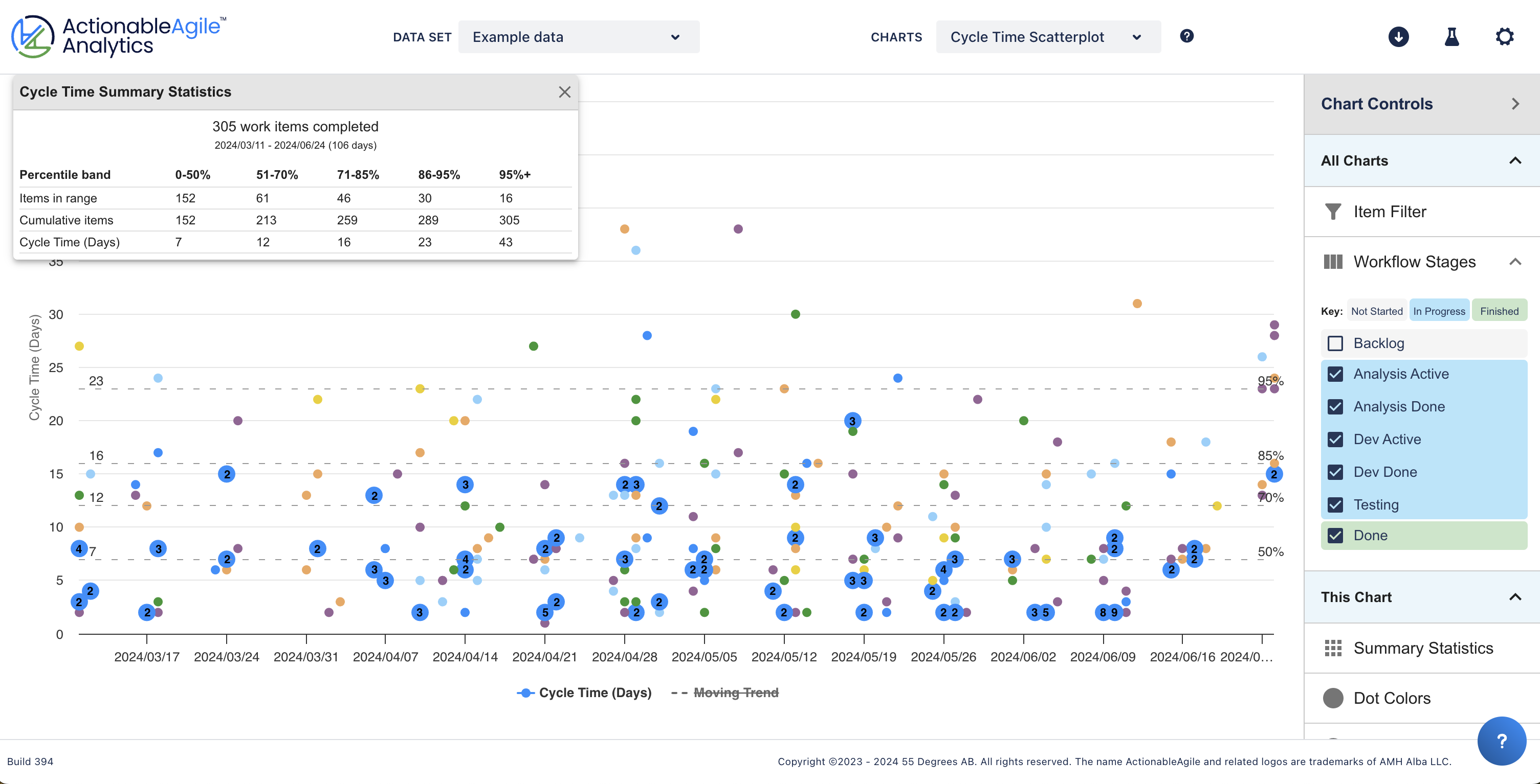
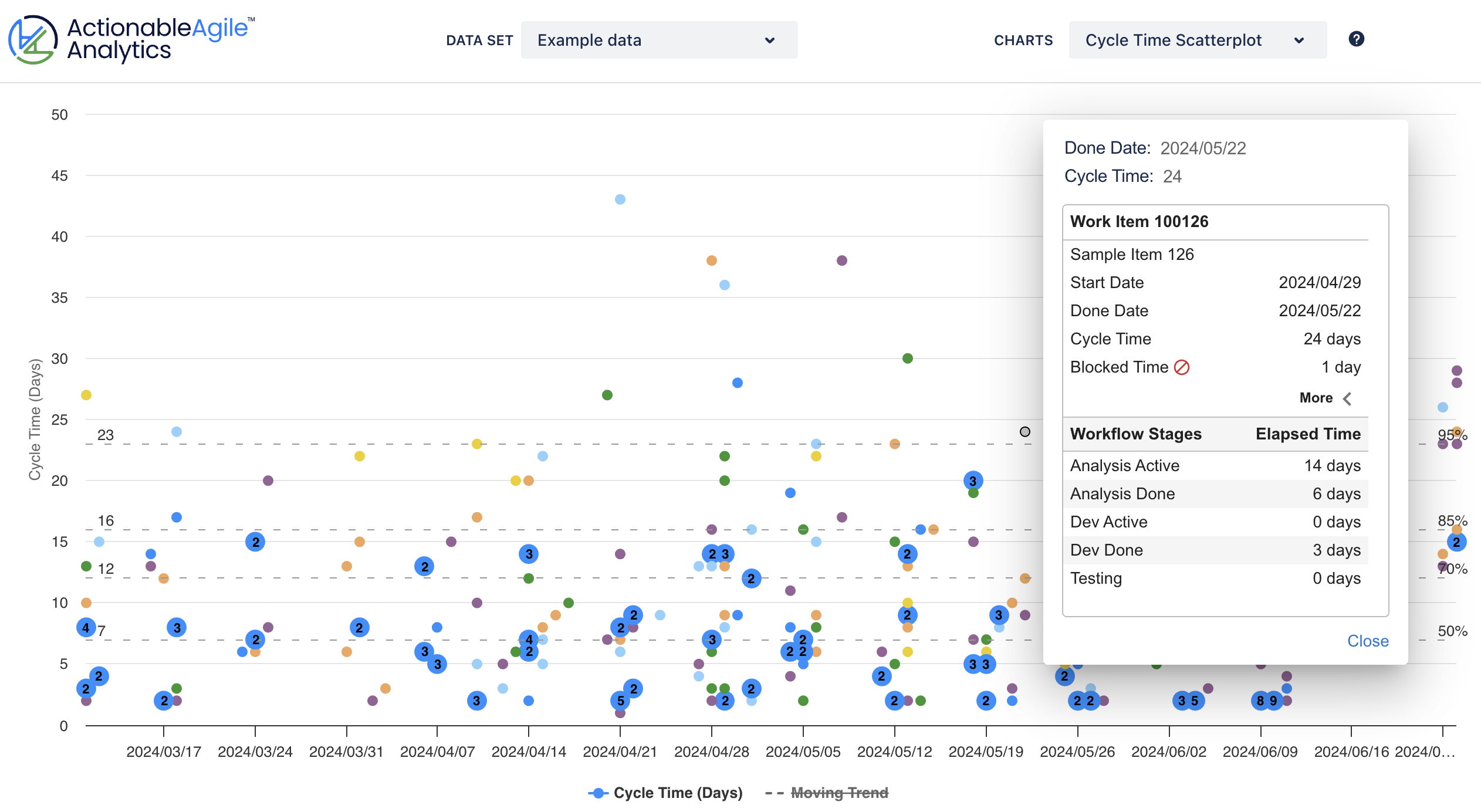
First and foremost, you can find the cycle time of an individual piece of work
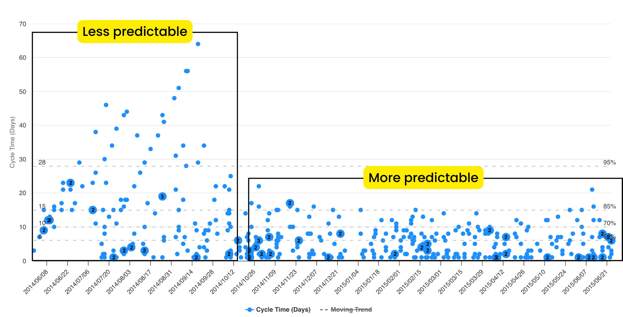
You can also see at a glance if your cycle times are getting more or less predictable by looking to see if the range of Cycle Times is increasing or decreasing
You can see how long it took to complete work items in the past and use that to realistically forecast expectations for how long a work item may take to complete in the future.
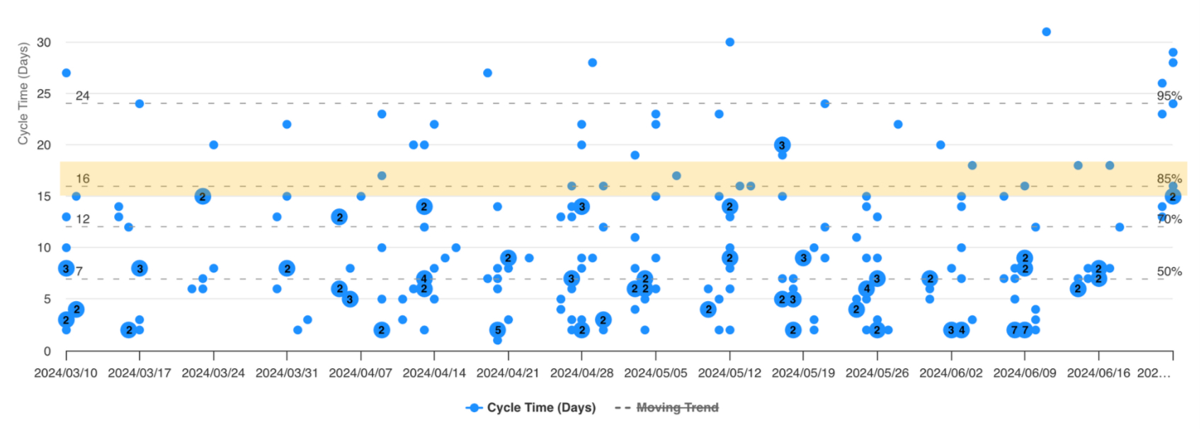
You can use this information to set a Service Level Expectation (SLE) for your team. This can be useful as an internal team metric to use in the context of current work item age to help maintain or improve predictability for the future.
Additionally, you can learn about your process and the work that goes through it by exploring the clustering patterns of dots as well as the empty space on the chart. Asking questions about why the chart looks the way it does helps you learn about the impacts of certain decisions and events so you can make better decisions in the future.
The Cycle Time Scatterplot in ActionableAgile
The Cycle Time Scatterplot is the chart that you land on when you load ActionableAgile because it is the one that most people begin with on their journey to better flow.
Excited to explore flow with your team? Try ActionableAgile for free today and reach out if you need any help via our support portal.