Throughput is a flow metric that tells us about the rate work items are finished in a given process. ActionableAgile has multiple charts that can give you information about your Throughput:
The first two are specifically made to relay information about the Throughput of your process. The last two happen to tell us throughput as a byproduct!
Want to learn more about Throughput in general? Check out our "What is Throughput?" blog post. To learn more about these four charts in ActionableAgile, keep reading.
Histogram
The Throughput Histogram is a bar chart that displays how often you experience certain daily Throughput – in other words, the frequency of Throughput values.
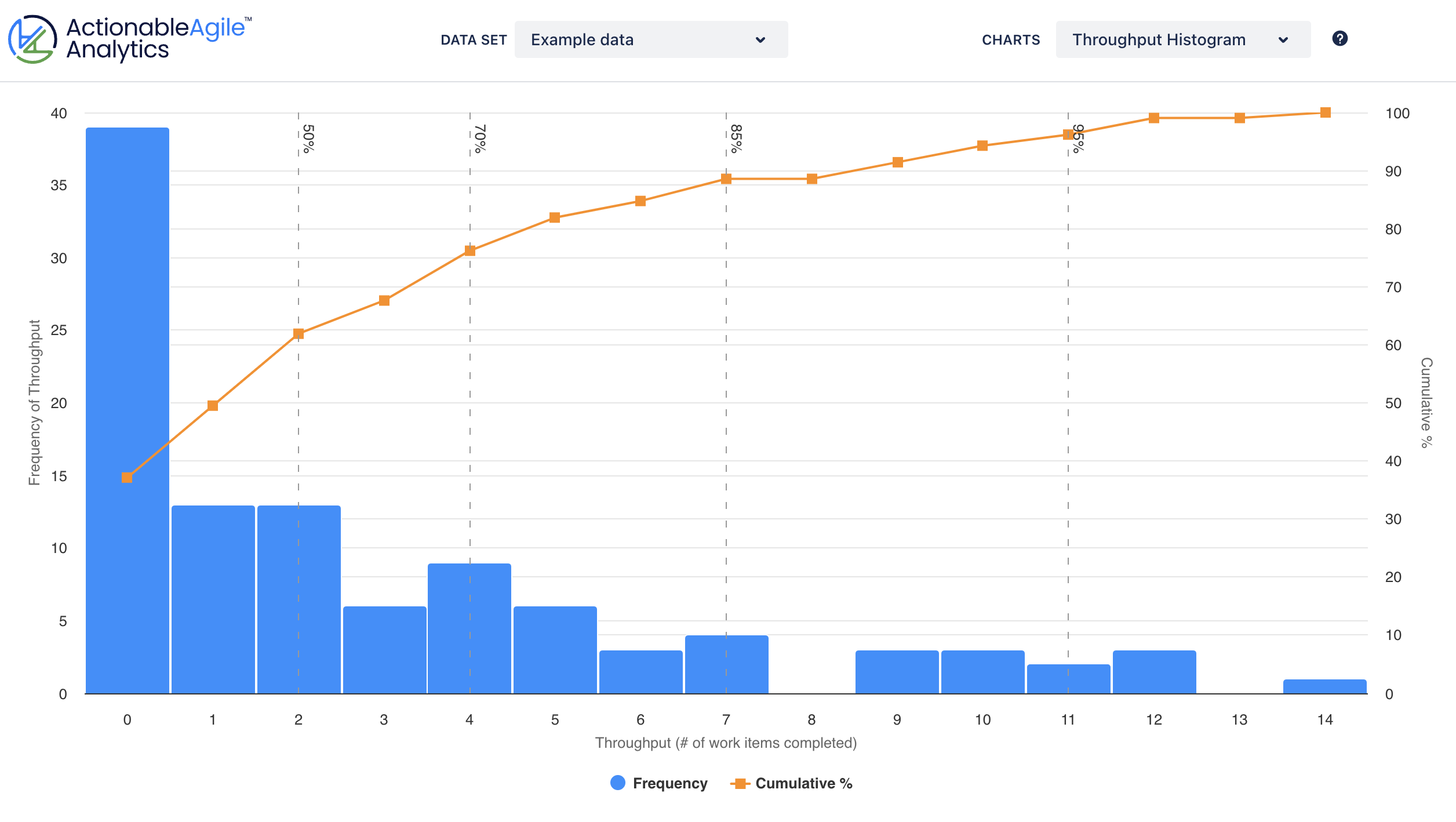
You can use the histogram to see what throughputs are most likely for ONE given instance of your time unit - one day or one week, etc. This is often not sufficient enough for forecasting across multiple instances of your time unit (multiple days, weeks, etc.).
Read more about our Throughput Histogram in our product documentation.
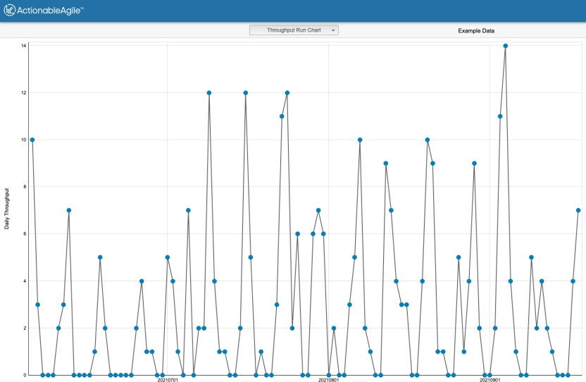
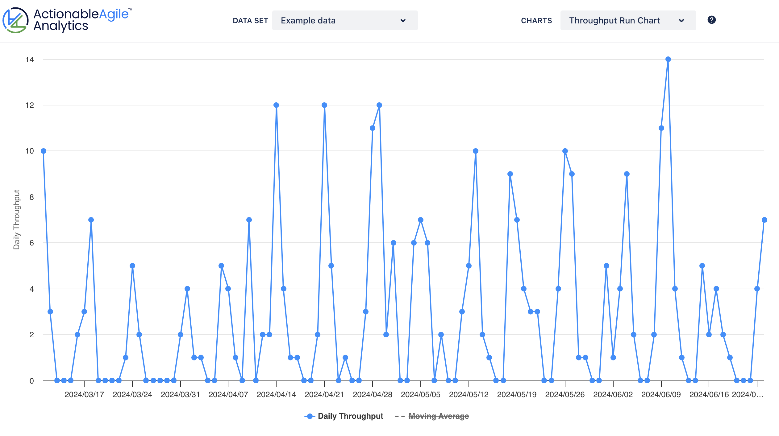
Run Chart
The Throughput Run Chart is a line chart that shows you the variation in your Throughput data over time.
This is, hands down, the best chart to use for straight Throughput analysis because of the time axis. We believe that all time-based metrics are best analyzed on a time-based chart. Time-based charts allow you to see patterns in your data over time and ask questions to learn more about how your team worked and why. You cannot discern this pattern-based information in a histogram.
Read more about our Throughput Run Chart in our product documentation.
Cycle Time Scatterplot
The purpose of the Cycle Time Scatterplot is to tell us all about a different flow metric called Cycle Time. However, as the Cycle Time Scatterplot has data points representing all finished work across a time axis, we can look at those points and indirectly calculate Throughput values.
In the Scatterplot, you'll toggle on the Summary Statistics box via the Chart Controls.
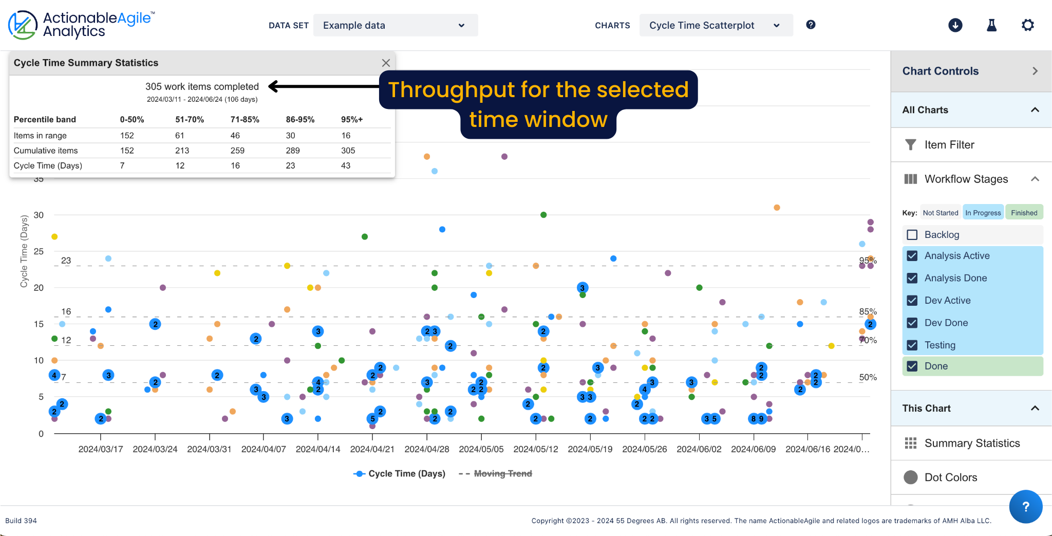
In the example above, you can see that 305 work items were completed in 106 days. As you use other chart controls, including the date or item filters, the summary statistics will update so at any given time you see the total throughput for a set number of days. You do not see how the throughput values change over time as you do in the Run Chart.
Read more about our Cycle Time Scatterplot in our product documentation.
Cumulative Flow Diagram
The Cumulative Flow Diagram is a stacked area chart that is built by adding information from a daily snapshot of your process each day. One of the things you can see in the Cumulative Flow Diagram is how many items left one part of the process and entered the next part.
Because Throughput is defined as the number of items that finish in a given unit of time, you can get Throughput information by looking at how area band that denotes your "finished state" is changing over time. However, the CFD doesn't provide this information for you at a glance. That's what the Throughput Run Chart is for.
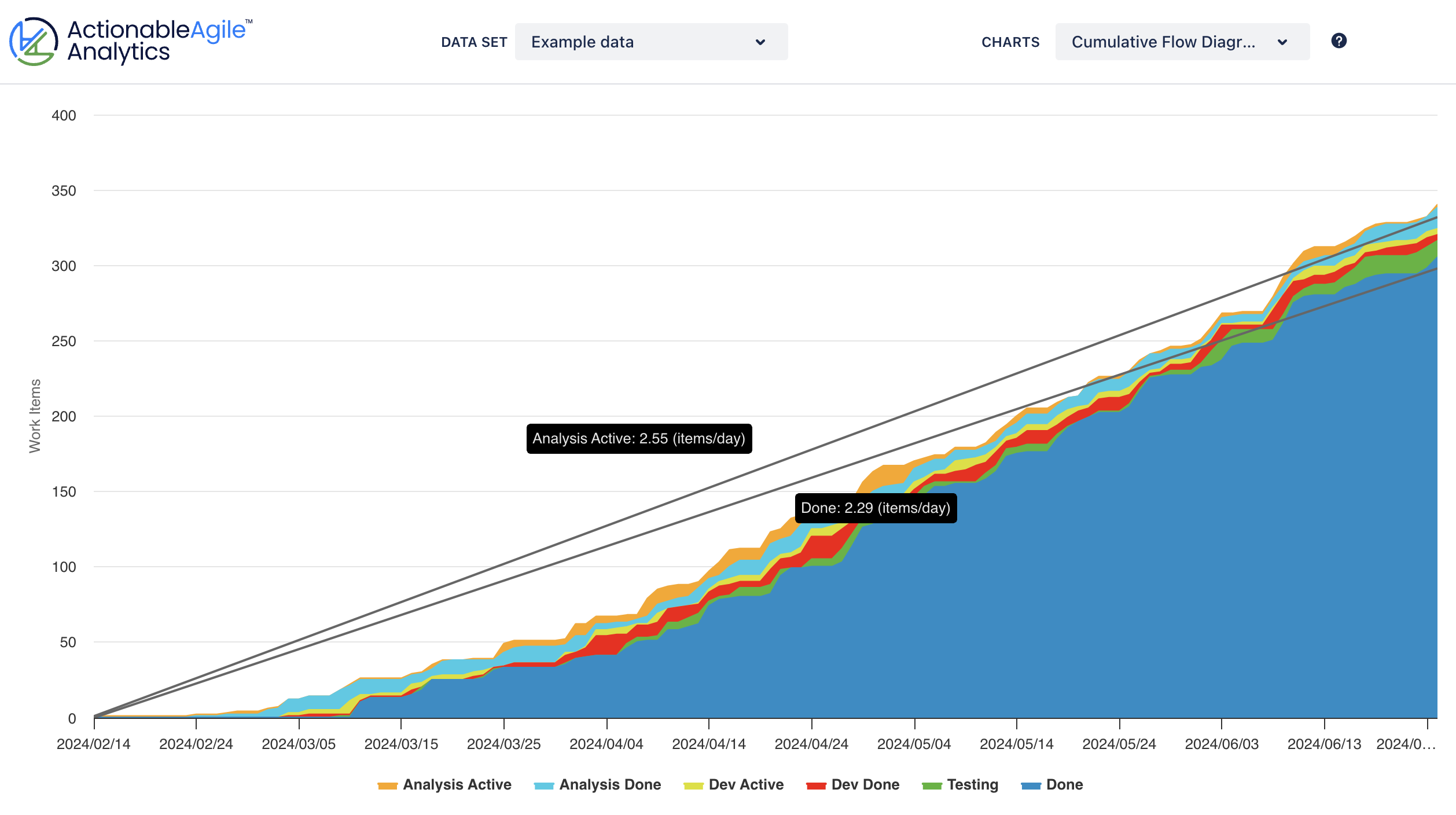
The other related information you can get from the CFD is the average throughput, also known as the average departure rate. You see this by turning on the rate lines.
Read more about our Cumulative Flow Diagram in our product documentation.
In summary...
There are many ways to learn about the Throughput of your process in ActionableAgile. So, here are our suggestions:
Use the Throughput Run Chart for seeing how your Throughput changes over time.
Use the Cumulative Flow Diagram to see how Throughput interacts with other flow metrics.
Finally, use Monte Carlo simulations that work with your Throughput data to forecast efforts containing multiple work items.
Excited to explore flow with your team? Try ActionableAgile for free today and reach out if you need any help via our support portal.